Monday, 15 May 2017
MY MUSIC MAGAZINE EVALUATION VIDEO
https://www.youtube.com/watch?v=qvEHHVK7AeA
This is my evaluation video the link above will take you to youtube.
Sunday, 14 May 2017


Thursday, 11 May 2017


Media Evaluation Script (go with powerpoint)
Media Script
Slide 1: My Media Evaluation
Slide 2: This is my music magazine compared to my first
draft I realised how it looked too much like a Fashion magazine
so I changed to my final version to look more like a music magazine with the
title and words used,
Slide 3: This is my Media Evaluation for my coursework
in making a Music Magazine,
(Question 1: In what ways
does your media product use, develop or challenge forms and conventions of real
media products?)
As you can see here I’ve learnt how to
analyse a magazine cover in order to make my magazine have all the key features
a magazine needs. This here is the Masthead; the masthead is the Title of the magazine so the
audience know what brand of magazine they’re choosing to read. Next here is the
Cover Lines, these
are important to a magazine as they’re the main headlines about what is in the
magazine, giving the audience an insight into what is in the magazine so they
can choose if that is what they want to read about. As you can see here we have
the Tag/Lure this as
the title suggests to lure in the audience into buying the magazine by using
interesting words to incise the reader such as ‘Exclusive’ The strap line is the
subheading of the magazine positioned under the title, with then comes the Plug this is the selling
point of the magazine. Then the date
line where that date and price is showed.
Slide 4: I experimented
with these magazine features when making my Music magazine, as you can see I’ve
used (show them all) showing I've used typical magazine styles to interest the
reader and showing what I have learnt from my analysing process.
Slide 5: For my Music
magazine, I've used influences from the only ‘pop’ magazines that are around
because this is the genre I was looking at, these have inspired me to create a
new magazine which isn’t out yet. The only pop magazines there are out at the
moment, are old with not very well-known artists, such as ‘smash hits’
and magazines like ‘The rolling stones’ are also old and aren’t very
bright and colourful, with the Rolling Stones also being more a male magazine,
there are also magazines such as ‘We are Pop’ Which is for young
audiences. This is when I started to
look at BillBoard this magazine is an All Genres magazine but also
includes popular artists and is colourful and eye catching as well as being
classy,which is how I wanted my magazine to be. Because of this I have brought
out my own magazine which hasn’t been done before, as its classy, colourful and
appears to a variety of audiences interested in Pop magazines. Looking at these
influences I discovered how some magazines portray their selling points in
different ways, such as billboard putting it across more subtle so it doesn’t
look messy but more classy, showing they don’t need to bribe people into buying
the magazine. As well as the magazine smash hits, no longer around anymore it ended
in 2006 bringing more space for a different magazine to the market.
Slide 6: Double Page Spread
I discovered how here they use a dramatic image very
big on the double pages with huge writing to take up the double page, The
images are positioned as the writing fits around the image showing the
importance of the artist, The colours also contrast perfectly together and in
both double page spreads there is a clear statement, with the one on the left
we see a very hipster, wild side of the artist with a deep quote ‘Girl, you’ll
be a woman soon’ with the word girl
positioned so the artist is a pause between the rest of the sentence, making
the image look very dramatic, as well as the lighting making the image centred
as the light hits the artist and a dark radius goes around the edge of the
spread, also we can see the writing on the right must be to do with this
artist. As you can see there also isn’t very much of the writing in the left
picture compared to the right, as we can see in the right double page spread
there is a rather big model positioned mostly on the right with her arm being
on the left after the fold, the image is also very dramatic but more fun and unique
as its very colourful and has a lot going on, giving a very careless vibe and
showing how fun and vibrant the artist is, we’re also shown how the image is
clearly edited onto the pink background as she’s stood out from the background.
Once again the title is bold and we clearly know who the artist is, we’re also
seeing how much writing covers the double page as it is positioned around the
image. We can see how both of these double pages portray a pop magazine vibe
Slide 7: This is my
magazine, as you can see I've used (The different techniques established in the first
slide) while
keeping it classy. I decided to create a Pop magazine because I felt there
isn’t my certain sort of magazine on the market yet. For my image my model is
positioned to illustrate a connection with the audience as she is looking
directly to the camera also showing confidence and pride within being in the
magazine, with her eyes being sharp. I also have her on the right-hand side so
she’s being shown as a big part of the magazine but also having space for the
cover lines and other typical features.
I’ve
positioned her hair in a messy but volume way to create a dramatic look with
attitude to the artist. Purposely I've dressed my model in up to date clothing with
the pink bomber jacket to show the models style as being trendy and something a
pop artist would wear. Also the pink bomber jacket also contrasted perfectly
with the pink background showing a relation between her and the magazine and
making her face stand out to the audience, I used the influence of billboard to
help with styles of image positioning with the use of plain backgrounds to make
the image stand out. To create the lighting, I had two lights set up either
side of the model as well as using my camera flash to make her as bright as
possible because my magazine is all about colour and using that to interest the
audience. The title of my magazine is called ‘TOPHITS’ which I thought was a
simple remembering name, I used a bold font, as the MastHead should be
remembering so the audience recognise the brand, this is positioned at the top
of the page to make the title clear, my name also shows the genre of magazine due
to the name and the music disk this is important. The rest of the font in my
magazine is classy and elegant with the artist’s name bold giving a highlight
to what artist is presented, with a subtitle of ‘Queen of Pop’ to also show the
reverence of the artist and once again it’s a pop magazine. In this issue, the
colour is mainly pink, black and white with yellow showing a vibrant artist who
is quite stereo typically girly.
Slide 8: These are a
handful of pictures I had taken to be my artist in my magazine. I tried to
portray a stylist artist with attitude and colourful clothing to represent
someone the audience would see as a popular music artist. (first image) As you can
see in this image the artist is modelling emotionless which could be a front
cover image because it’s very dramatic. (Second image) Just like the first image this I
would have done as a front cover (Third Image) This image is a perfect for a double page
spread because it’s a very chill image and is a wider image to spread across a
double page. (Forth) These images
are good for a contents page.
Slide 9: Here you can
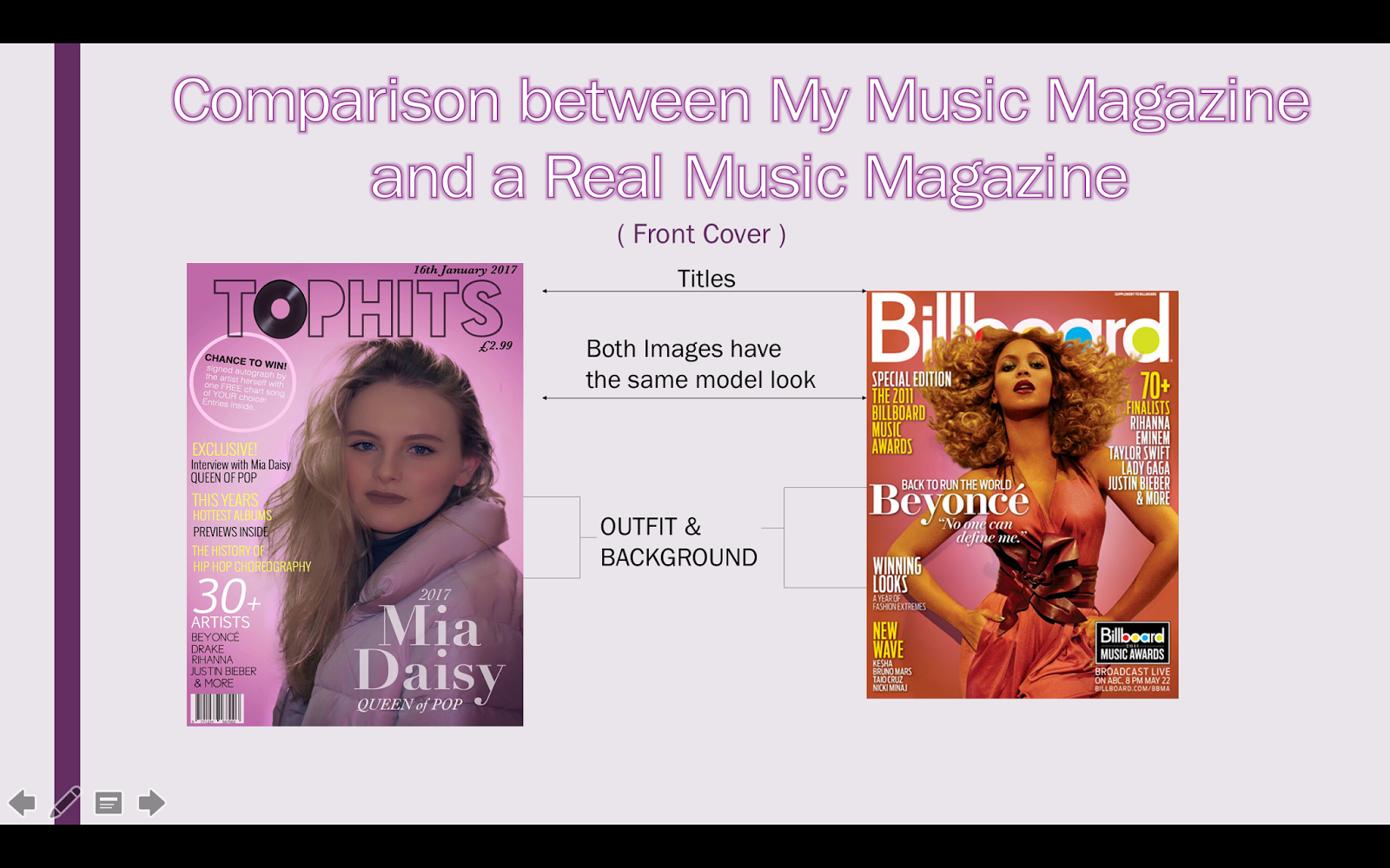
see how I’ve used a clear title to show what brand of magazine it is, I’ve also
got the same model look to the artists, as well as having the outfit of the
artist matching to the background.
(say
about stereotypes) You can see how the artists of real covers all do the
same drama pose, with the costume matching the back ground, they're represented
as being powerful
Slide 10: Stereotypically
Pink for girls
Slide 11: Evaluation 3
(What kind of media institution might distribute your media product and why?
(Say
About Rolling stones)
Might
want to publish because it’s a new
magazine as they do general magazines not just pop.
I think they will want to publish my magazine
because mine is very similar to billboards except it’s a just pop magazine
which means it will suit their magazines but with a different genre, which
might appeal to their audiences which are interested in Pop Music, they also
publish(Backstage Billboard The Hollywood Reporter Spin Stereogum Vibe Film Journal International Clio Awards) So
they publish other Music magazines too which have different genres.
Slide 12: Their aim is to attract good authors and publish books
that achieve commercial success. Depending on the size of the publishing company,
the book publisher may carry out all aspects of publication, or may
delegate part of the work to editors, designers and marketing specialists.
Slide
13: I have Three types of revenue
making ideas for publication, is subscriptions, people buying my magazine
through subscriptions so very month they’re paying for the magazine to be delivered
to their house, these assure reliable customers. Revenue gained by marketing or selling products or services associated
with a magazine title. An example would be t-shirts with the magazine's logo.
Or advertising, by advertising well known brands in my magazine I will earn
more money by every issue sold.
Although
by doing this I must be considering regulations such as copy right,making sure
none of my pictures in my magazine are copy righted as well as my text and songs inside must have
permission from artists to publicise them.
Slide
15: (Just People interests)
Slide
16: You Gov) I took to yougov to see what my audience would like
and looked under MTV Hits and got a positive feed back
Slide
17: As you can see My magazine already fits the type of
people that like pop music, as my magazine is more female and for younger
people.
Slide
18:
1.Here are the types of artists people who like Pop Music and what type
of artists they like
2.As you can see they like quite
stereo typically girls shows, such as Firs Dates, Sex and the city and Geordie
Shore
3.You can see how they like very well known brands showing how my model
in my magazine is up to date with the fashion my audience are into, Also this
gives good ideas into my publishing my magazine as to what brands I advertise.
Calvin Klein, Dior etc.
4.In General interests to people who like Pop music, as you can see are
interested in Dance, people and celebrities, beauty etc. As you can see form
the YouGov statics i've made my magazine fitting for my audience likes.
Slide
19: My magazine attracts a teenage audience because its
very social media orientated which fits to there generation, they have trendy
fashion and want to follow their idols they see in the magazine, they like pop
music, festivals and music tours, I've used a very pink stereotypical colour
for girls to the magazine focuses on teenage girls as they also like the pop
music younger teenage about 15 to 18 year old, due to the magazine Billboard
being a very modernised magazine I took inspiration from this magazine due to
other pop magazines such as “we love pop” are for a younger audience and I
wanted to produce a magazine that isn’t on the market yet being a older
magazine for the older teenagers with up to date trends and music likes for pop
lovers. As you can see colour is mostly pink trying to appeal to the feminine
audience but other issues could be other colours just this colour fitted well
with the girly artist in the front who also is styling the lasted trending
clothing being from topshop a bomber jacket, I believe my magazine has a Unique
selling point due to it being the only one like it out at the moment with the
older teens with the music and artists.
Slide
20:
Firstly to create my front cover I decided on a plan I
wanted to make my model be on a different coloured background, in order to this
I took the original image and cropped it down at a A4 size like a magazine
cover.
Slide
21: After I cropped the image I went onto making the
background the colour I wanted, to do this I had to use the refine edge tool, I
had to use this tool in order to select the image accurately with picking up
the models hair so it looks like the background the picture was taken on was
really pink, and so the picture looks more professional. I then used the filter tool to give the
background a light to dark spectrum to then make it look like the model is the
star of the magazine and so the attention is on her.
Slide
22: I then started to add text and using different fonts
with different colours to have everything standing out.
Slide 23:
I then finished my magazine and got people’s opinions
on it, to come to the confusion it didn't look very much like a Music Magazine but more of a
Fashion magazine, so I changed some things to show it’s a Pop music magazine
Slide
24: I did this by adding a Music Disk to the O in TOPHITS
and I changed out my Cover lines to representing titles such as ‘This year’s
hottest albums’ and ‘The history of HIP HOP’ I also then added more bright
colours like the yellow to break up the pink a bit more.
Slide
25: I also used google to research other magazines to get
ideas for my own magazine and looked in shops to real magazines to see the
different styles that were on the market at the moment because the ones I
mostly got inspiration from were magazines in a different country so I got to
see what magazines in my own country were like in comparison to ones abroad.
Slide
26: Looking back on my Preliminary task I can notice how
much I've learnt in comparison to the newest task, I've seem to of kept to the
same position of the image but haven't left much space for text without it
blending into the picture and not being very noticeable also the picture
doesn't look very professional. Also my Font is slightly all
over the place looking quite a messy and not very standing out, whereas my
music magazine the background is clear and the wording is standing out on the
clear background.
Slide 27:
(Showing
Comparison)
Slide
28: END
Subscribe to:
Comments (Atom)